caricature,caricatures,sandiego,losangeles,fresno,sanjose,oakland,bakersfield,SanFrancisco,sacramento,phoenix,california,southern,northern,arizona,texas,utah,party,event,artist
JAGuerzon
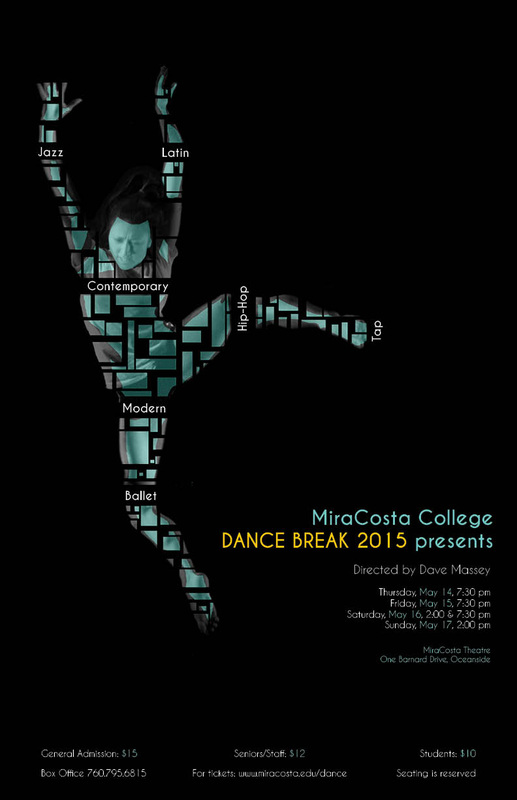
CARICATURE
LIVE EVENT CARICATURE
VIRTUAL EVENT CARICATURE
PAST EVENTS
BOOKING
DOWNLOAD
COMMISSIONS
CARICATURE
LIVE EVENT CARICATURE
VIRTUAL EVENT CARICATURE
PAST EVENTS
BOOKING
DOWNLOAD
COMMISSIONS